|
0 Comments
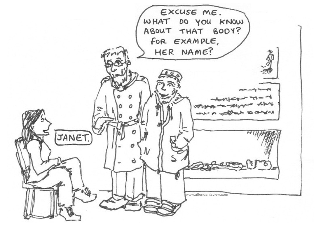
That awkward moment when one of the tour group might know more about the subject than the tour guide.
I'm fairly sure that people who made metal holders to burn ritual incense had fire...
I know that the past is a foreign place and that not everyone has had the privilege of being educated in how things were. This lass though was a gift through the exhibition, as in seconds she could veer from intelligent and excited interest, to questing thought, to a question that left you doing a double take in case she was winding her mates up. One of her mates pointed out that if Egyptians burnt things, they must have had fire, and conversation regarding "rubbing things together" followed. Some of you reading this perhaps have the kind of role and mindset which mean that you spend as much time photographing the labels and interpretive boards at visitor attractions, as you do photographing the attraction. Be it great ideas to steal, or the failed ideas you want to punish your graphic design friends with (I'm looking at you museum at the Globe Theater...) some signs just need a wider audience to appreciate them. Here's a gem from The Rock of Gibraltar. On a recent holiday I was left pondering - Did they plan to remove the older sign? Did they originally plan to locate the new sign in a different location? Did different people not communicate clearly about the sign's contents and/or location? Did they think the extra few mm in size would help people read the text on the copy of the sign shown on the sign, as opposed to the original sign? As an aside go and explore the Great Siege Tunnels if ever at the rock, as you don't have flipping Barbary macaques trying to nick things off you, they're cool, they contain far fewer tourists, and they are a very genuinely interesting bit of history.
"Let me get this right. Our ancient ancestors created vast and cunning wood and stone edifices to enable them to plot astronomical and seasonal events with great accuracy, yet with all the benefits of modern technology, you mistakenly celebrated the winter solstice a day early?"
At least they owned up to their mistake! Some of us really would have been put to wool gathering had we been alive in an earlier time... A special tour for a local adult special needs group.
It gets extra special if some of the people on it can't actually speak any English, and the guide is desperately trying to understand their stutter! Apparently, a good time was still had by all. |
Webcomic and occasional blog about the heritage sector. Follow The Attendant:Topics
All
AuthorAll text and images are produced by and copyright of the artist, holder of the domain name of attendantsview.com Archives
February 2023
|


 RSS Feed
